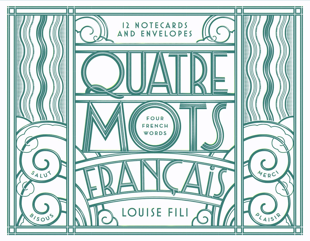
Hand-Drawn Lettering
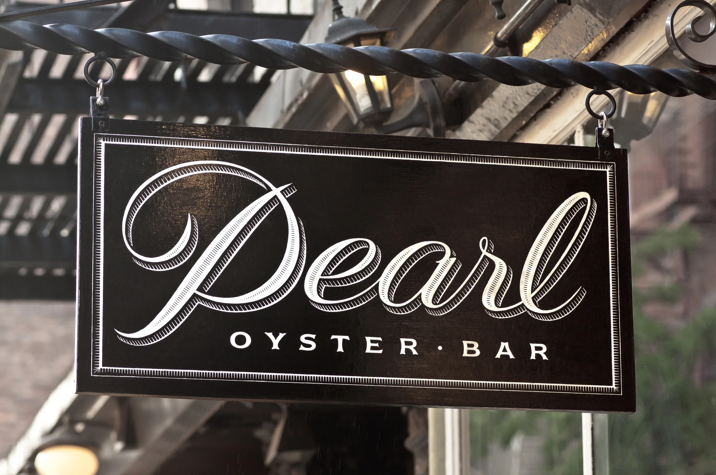
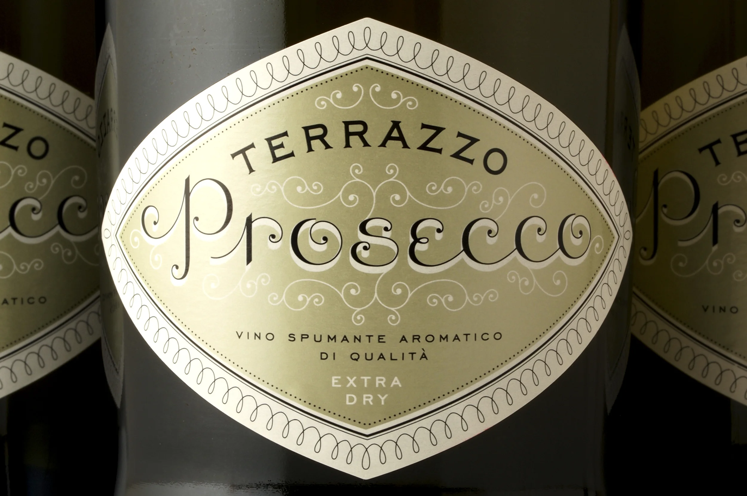
Louise Fili's hand-drawn lettering is one of the most recognizable parts of her work. Inspired by historical European typography and Italian signs, she creates custom letterforms instead of relying only on existing fonts.
New York-based graphic designer
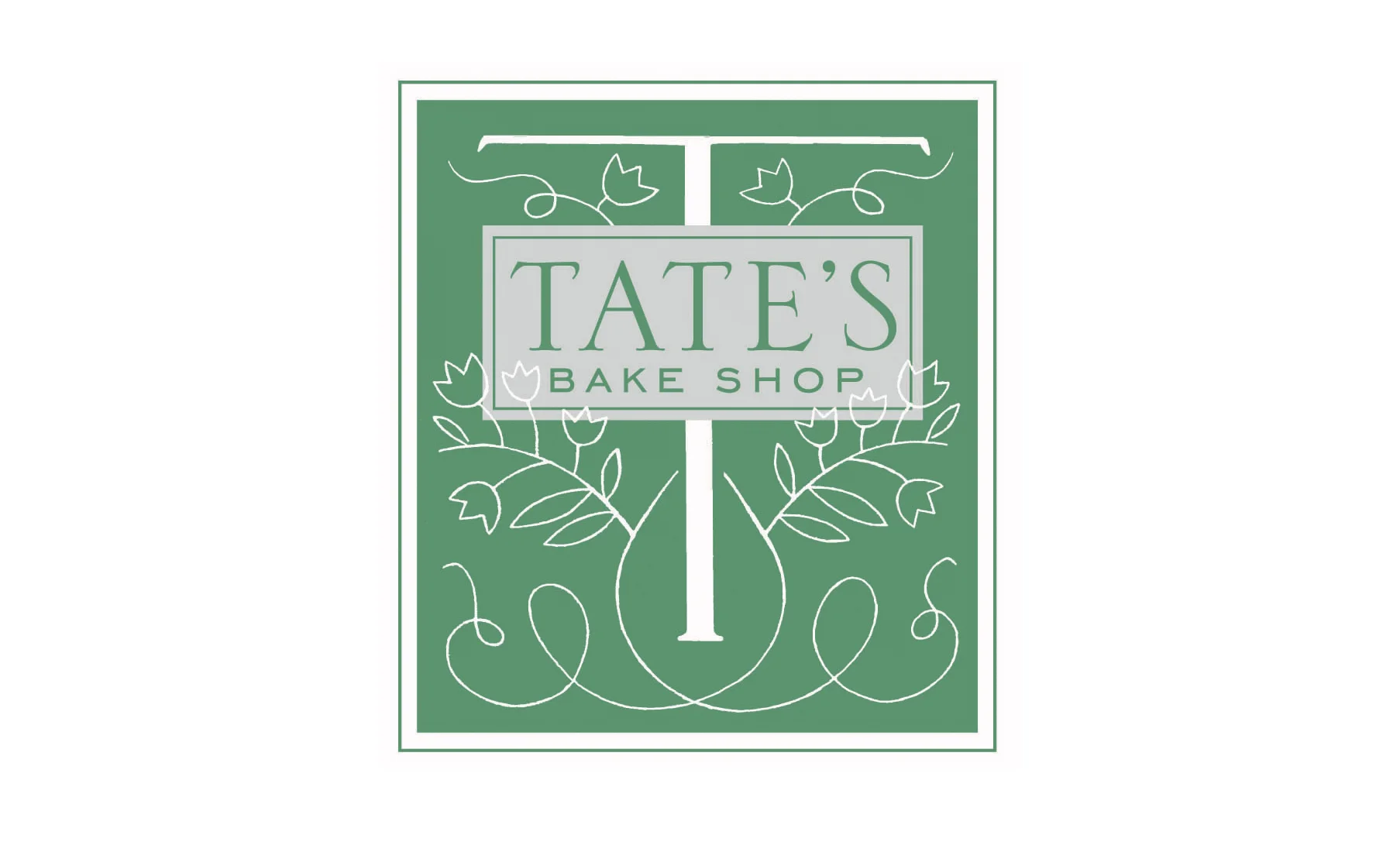
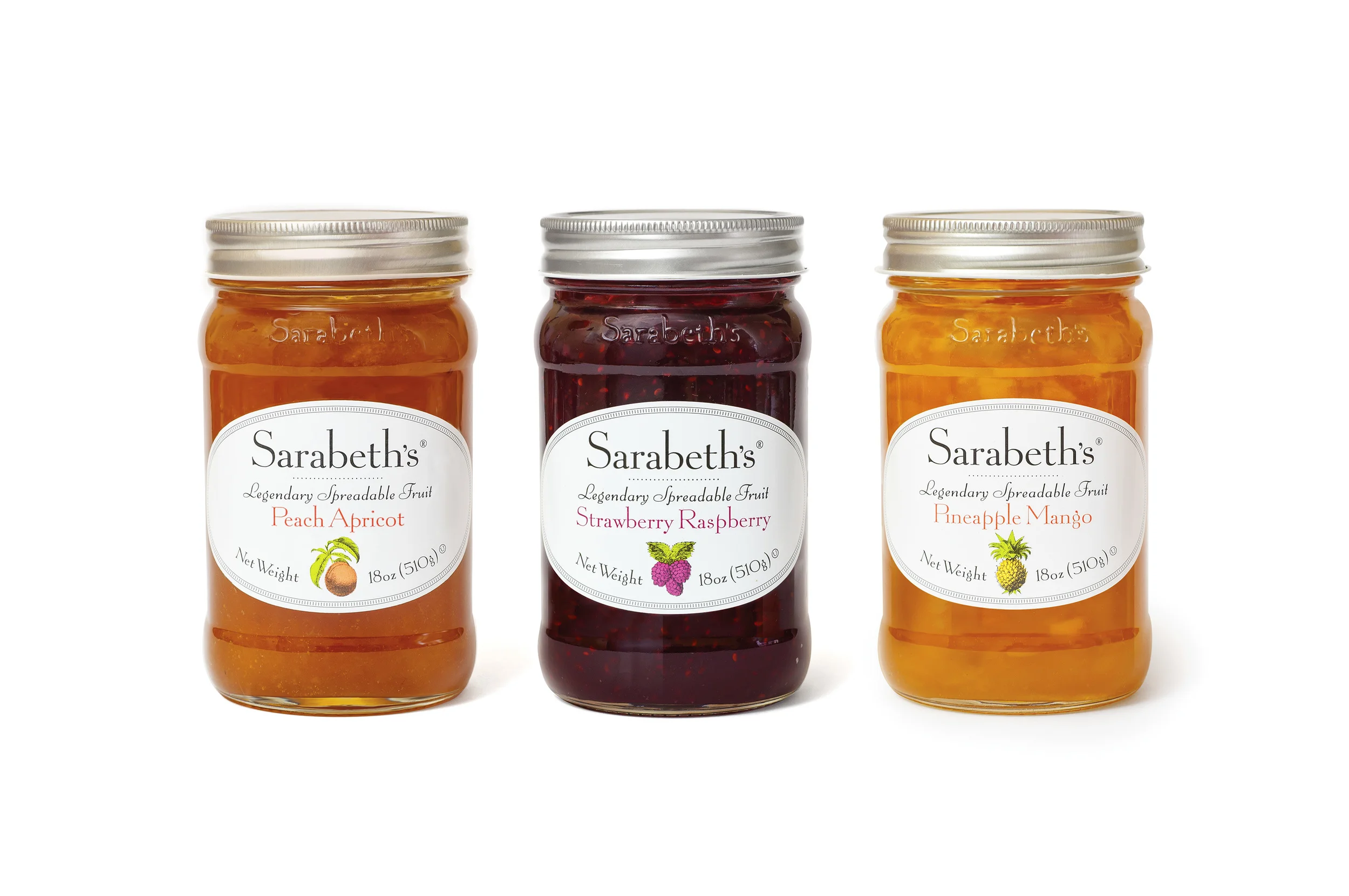
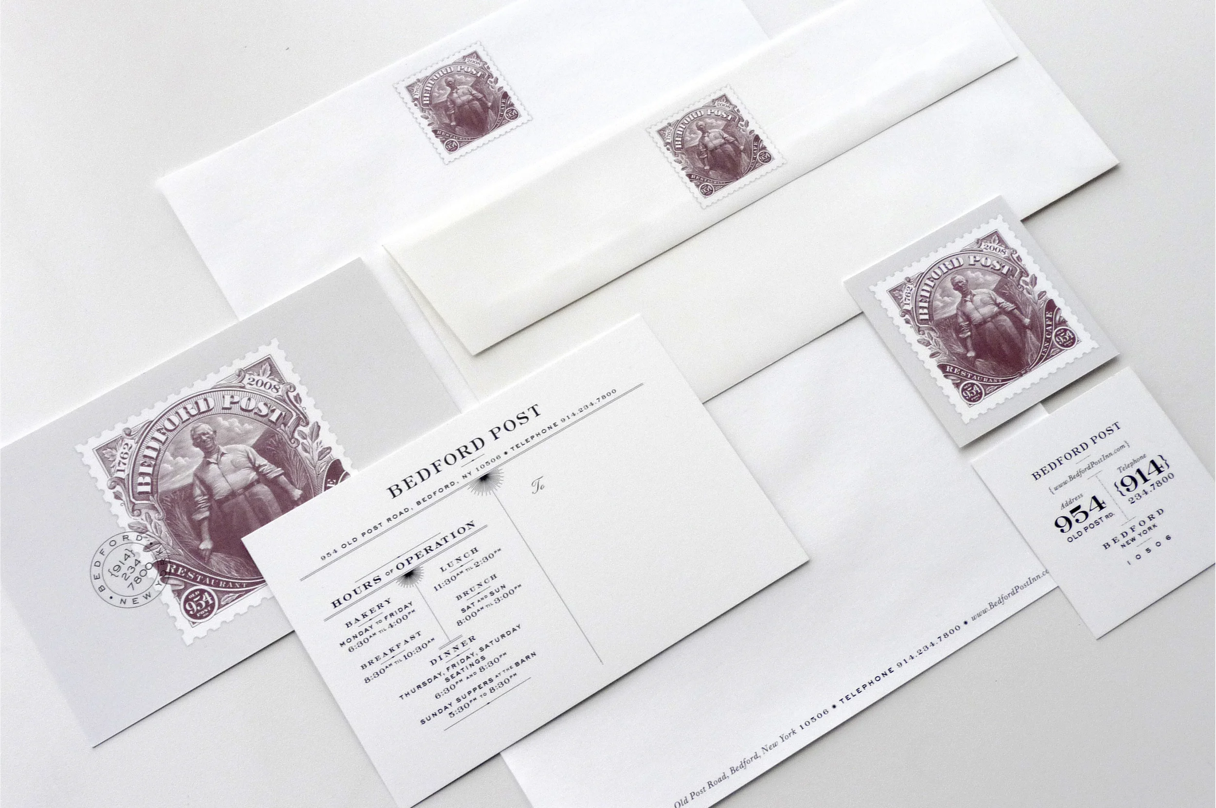
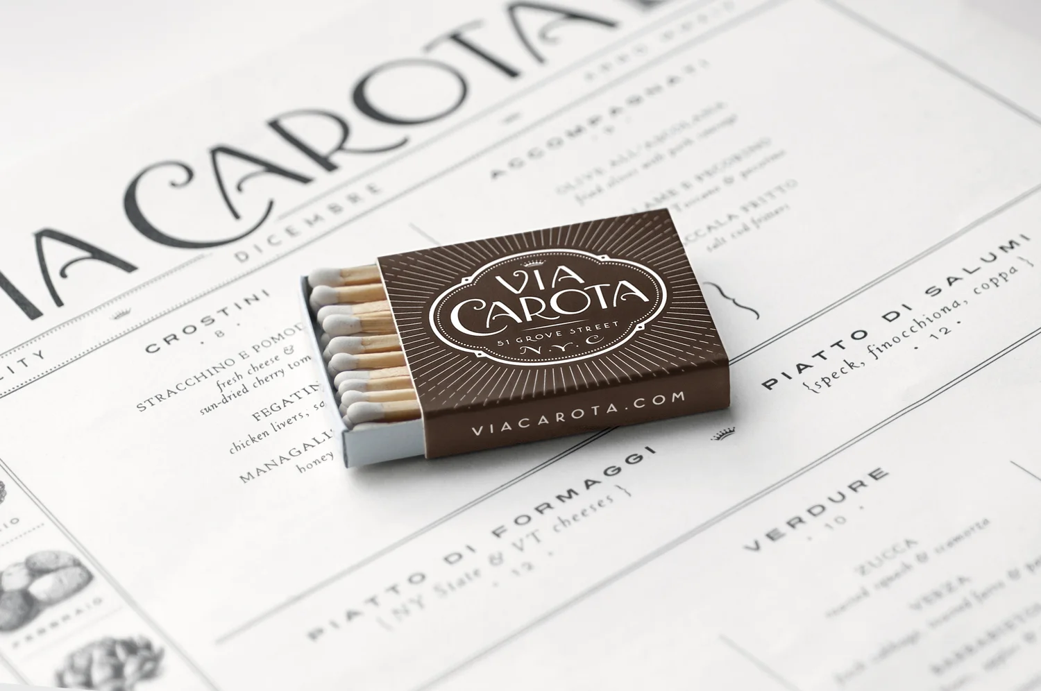
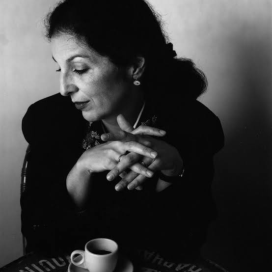
Louise Fili is a New York-based graphic designer, type designer, and author, best known for her work inspired by Italian visual culture and typography. She has created brand identities and packaging designs for well-known food brands such as Sarabeth's and Tate's Cookies, as well as restaurants including Via Carota and Pisellino.
After working as a senior designer for Herb Lubalin, Fili became the art director of Pantheon Books from 1978 to 1989, where she designed nearly 2,000 book jackets. She later continued her career through her own design studio, focusing mainly on food and restaurant branding.
Her work is included in the permanent collections of the Library of Congress, Cooper Hewitt Museum, and Bibliothèque Nationale. Through her long career, Fili has continued to make an important contribution to both graphic design and typography.


Hand-Drawn Lettering

Historical European Influence
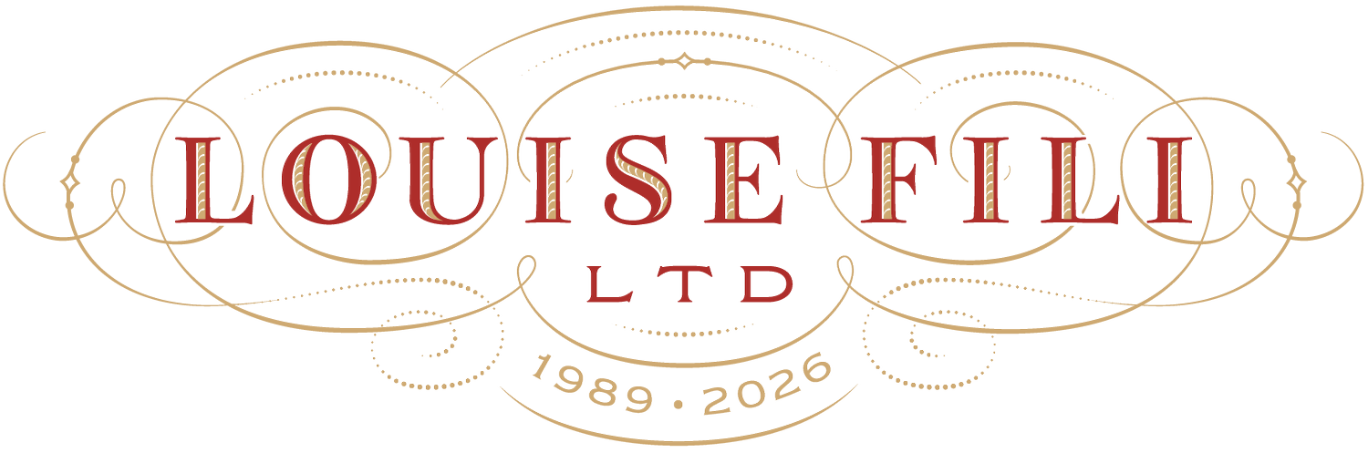
Decorative Ornament
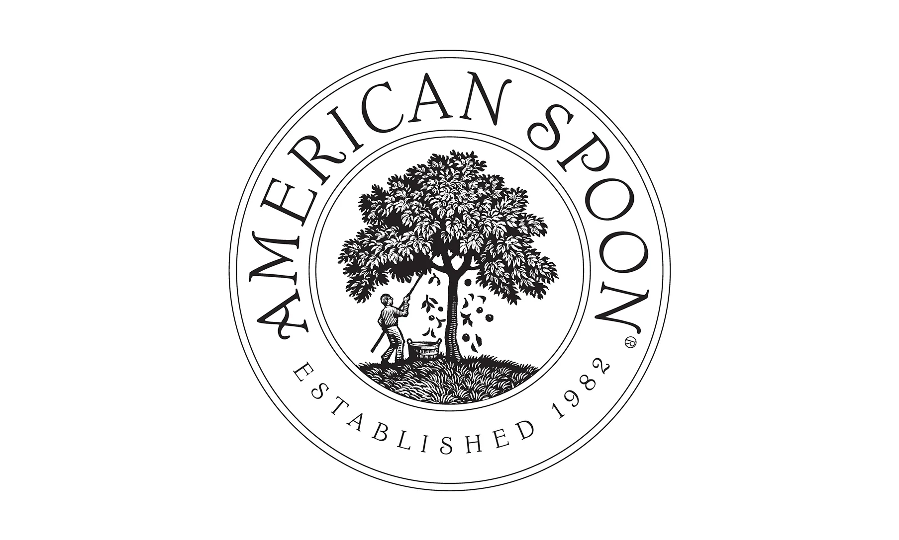
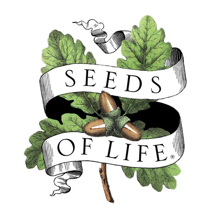
Food & Hospitality Branding
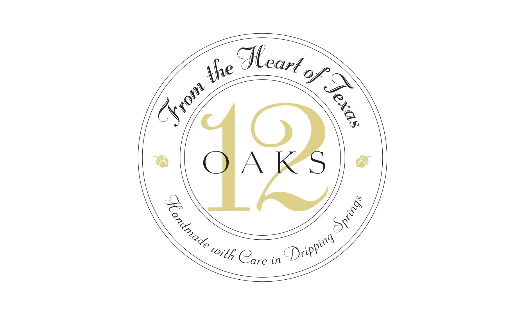
Elegant Serif Typography
Louise Fili's hand-drawn lettering is one of the most recognizable parts of her work. Inspired by historical European typography and Italian signs, she creates custom letterforms instead of relying only on existing fonts.
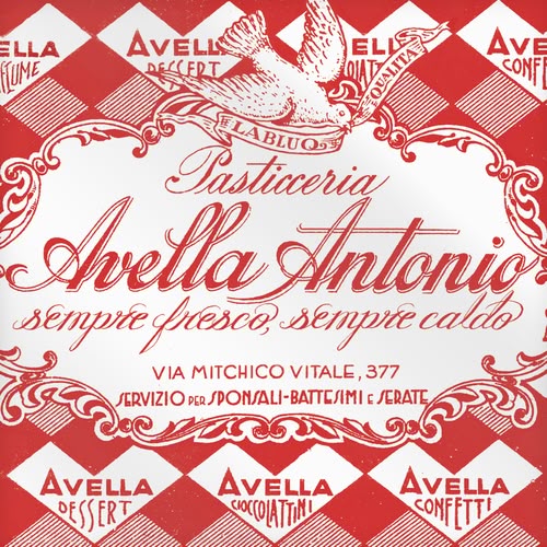
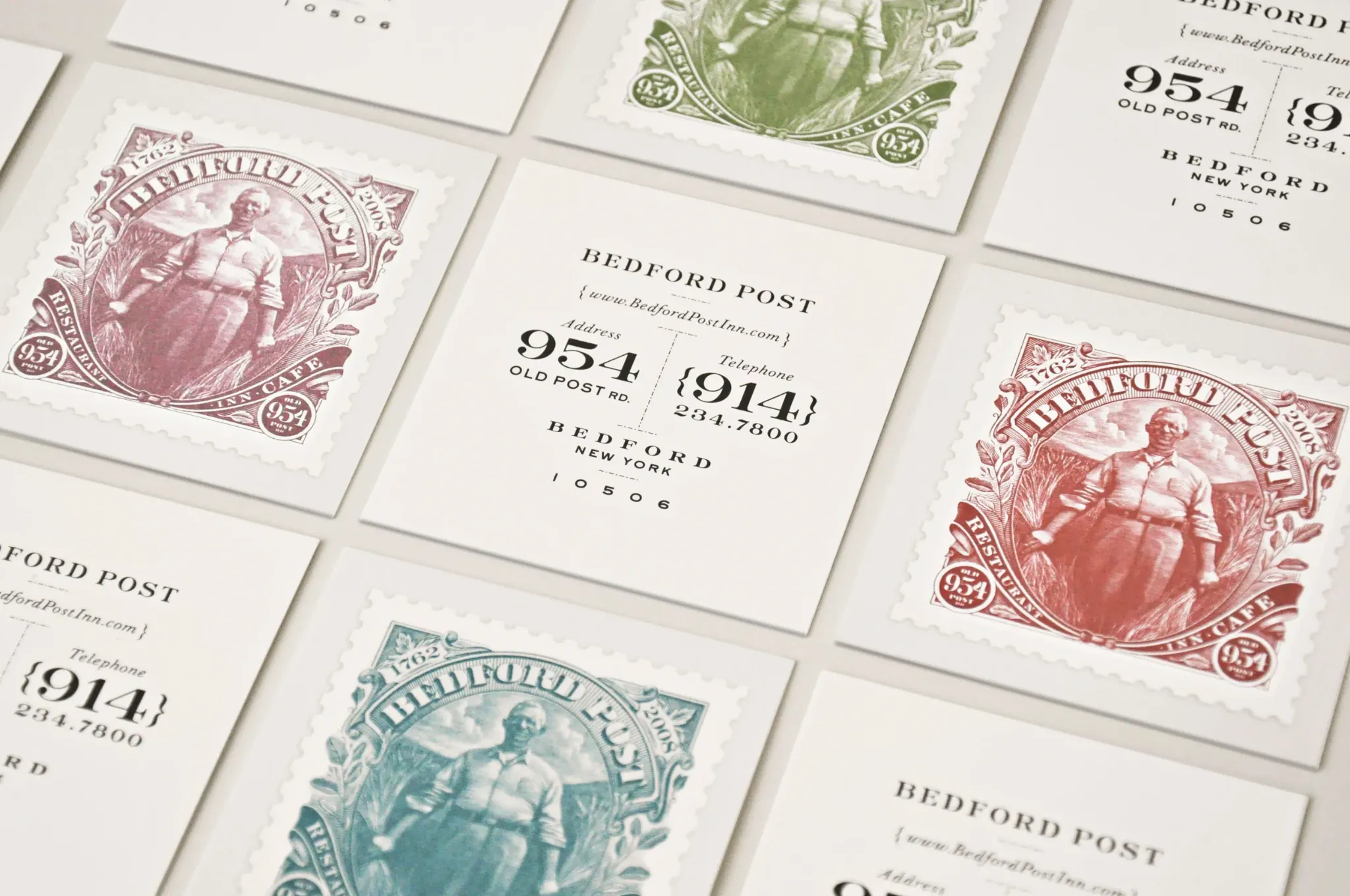
Fili's Italian-American background and her strong interest in Italian visual culture have deeply influenced her design style. She often looks to vintage Italian signage, European typography, Art Deco, and Art Nouveau for inspiration.

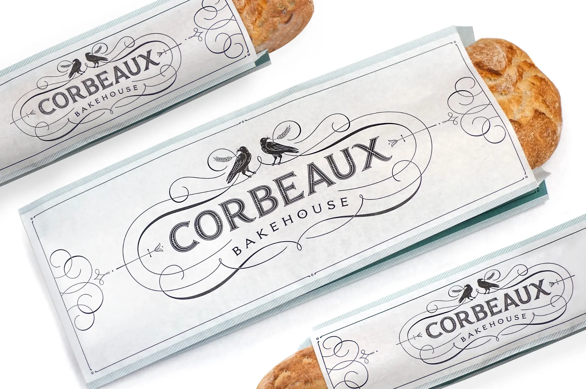
Decorative ornament is another recognizable element of Fili's work. She often uses borders, flourishes, frames, and small decorative details together with typography.
Louise Fili is especially known for her work in food packaging and hospitality branding. Her identities balance custom lettering, decorative details, and carefully designed packaging.
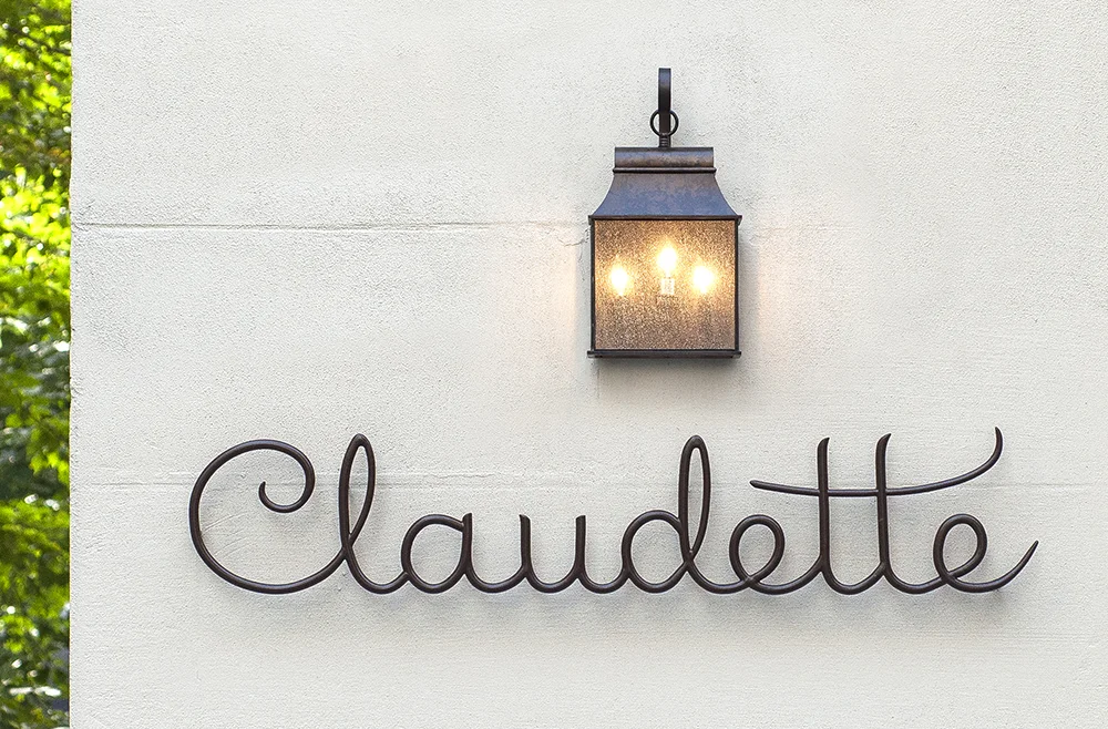
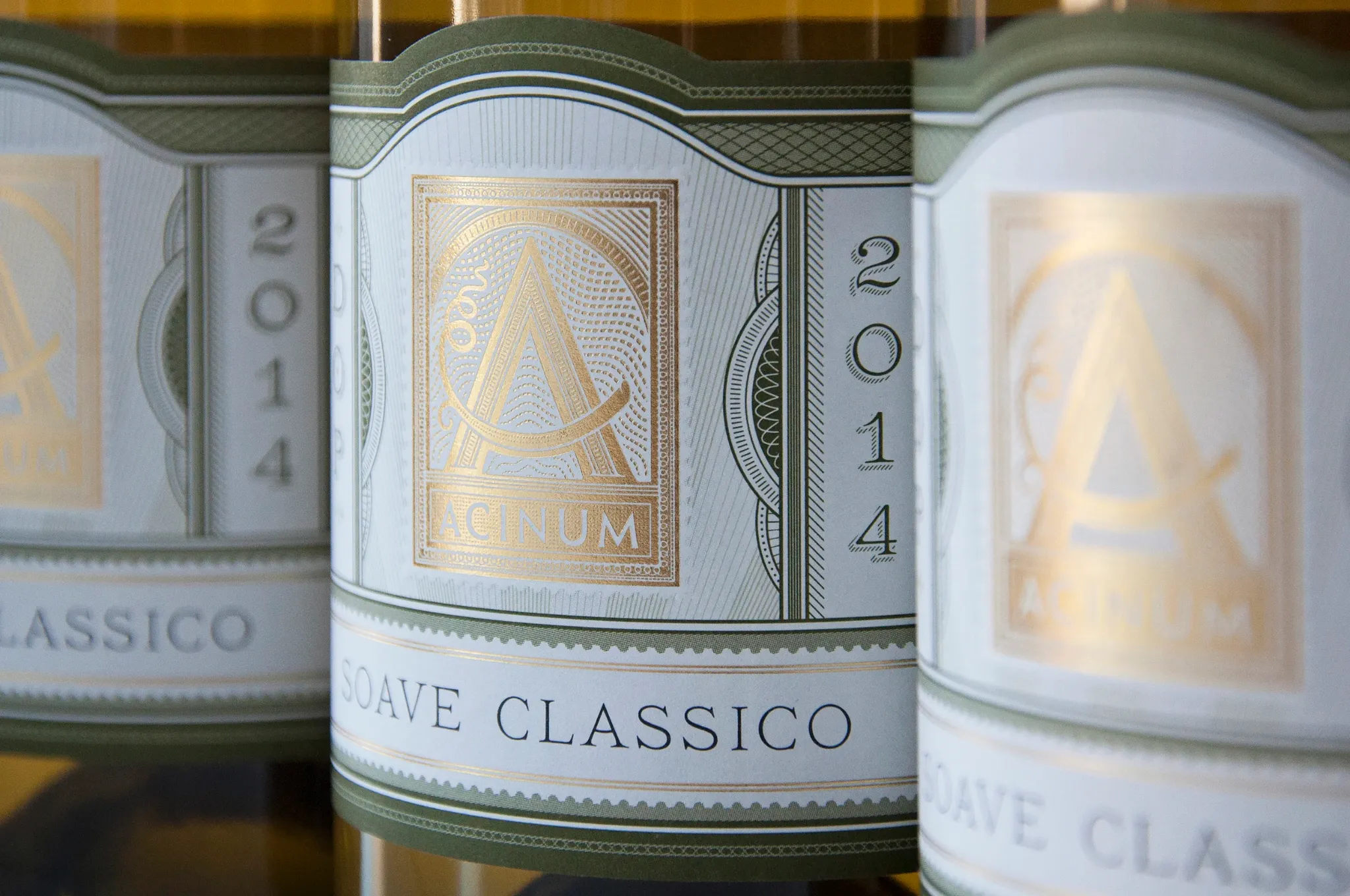
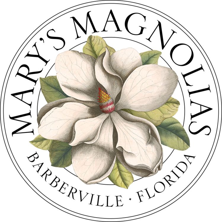
Fili often uses elegant serif typography inspired by historical European design. Refined letterforms and carefully balanced proportions give her work a classic and sophisticated feeling.
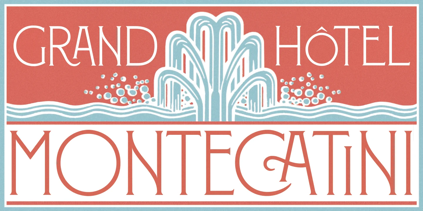
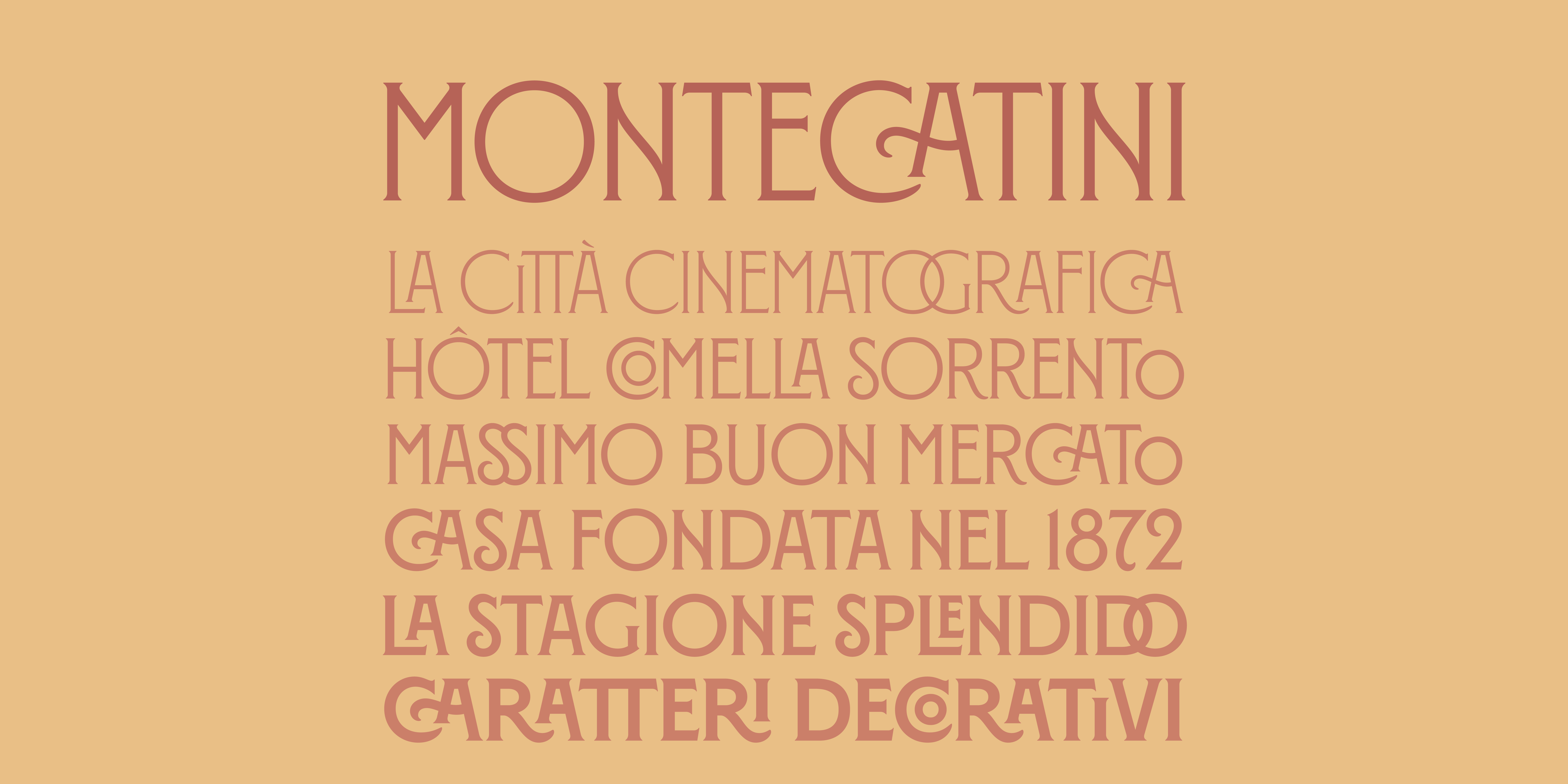
Montecatini is one of the most popular typefaces created by Louise Fili. It takes its cues from elegant Stile Liberty travel posters of Italy in the early 1900s. Its distinctive ligatures provide flair while its widths and weights allow for dynamic copyfitting.
Montecatini is a serif typeface that is closest to the Slab Serif classification, while also sharing some characteristics with Transitional typefaces. Its serifs connect softly to the main strokes, creating a transitional quality.
The typeface is also characterized by its tall and narrow proportions, with long vertical stems creating a strong vertical emphasis. Decorative details make Montecatini especially distinctive.
Overall, Montecatini combines the solid structure of Slab Serif with softer serif connections and expressive decorative details.